UW Concept Project: Tweetch.com
Project Overview
Synopsis:
What: As part of a graduate course in User Centered Design, in Autumn 2021, our team of 4 from the University of Washington’s HCDE 518 Masters program had 8 weeks to design a solution that fosters and promotes community for online livestreaming audiences.
Design Problem:
What: How can virtual communication in live streaming platforms be improved with different techniques to foster better community between game viewers?
Why: With the covid pandemic limiting the ability for people to meet and connect with each other in person, gamers resorted to watching live stream videos of video games to stay connected with one another. We wanted to find ways to improve the experience on how relationship and community are fostered for gamers who watch live stream videos.
Group members:
John Strohschein
Tony Li
Nick Moolenijzer
Nathan Ball
The design process we took for our project.
Process:
What: Used the agile approach to design a Figma prototype that allows customers to block toxic chat messages, create and invite friends to private and public group chats within the stream, and remove explicit language from all chats.
Why Agile: To gather frequent user feedback to create effective designs that address the root problems of the customer.
Top methods used:
Interviews
Surveys
Contextual Inquiries
Design Studio
Wireframes
Prototyping
Hypothesis:
What: Gaming livestreams are a valuable way to find others with similar interests, but toxicity and an overwhelming number of messages are some factors/reasons that are holding the live streaming platforms back from building better communities
Why: Live stream viewers are overwhelmed by the amount of spam and number of chat messages in the livestream chat that they don’t feel they can engage or be a part of a live stream conversation.
Solution:
What: Create live streaming solution that easily allows to engage with other viewers with similar interests via the chat while removing spam and toxic messages.
Why: This would remove some of the detractors of current live streaming platforms that discourage viewers from engaging with one another during a livestream.
Research
Surveys:
What: We launched a survey on reddit and via UW’s slack channels to gather data about live stream viewers.
Survey results on what live streaming platforms use to watch livestreams
What live streaming platforms are used
What were the different platforms used by viewers to watch live streams
What kind of content do viewers watch on live streams
What kind of material did viewers watch on livestream? Ex. Music shows, video game walkthroughs, game tips & tricks, casual chats, etc.
How do viewers currently interact with other viewers
What tools within a streaming service did viewers use to engage with others? Ex. Via the chat, via donations, via 3rd party tools?
Why: To provide insight on:
What tools were used
What areas we should further explore in our follow up interview study
Our survey received responses from 22 participants ranging from both the west and east coast of the US.
Interviews
What: We interviewed live stream viewers to understand:
User expectations
What did live stream viewers expect to see when interacting with each other during a live stream.
Moods & feelings
What frustrated and delighted viewers when interacting with others while watching live streams.
Walkthrough of livestream experience
Understanding inefficiencies and painpoints in the experience interacting with other viewers during a livestream
Why: To provide insight on:
What were the challenges viewers faced when interacting with other viewers in a live stream
Why these were challenges for viewers
Our team led interviews with 6 participants
Contextual Inquiries:
What: Our team observed people interacting with each other during an eSports livestream gaming watch party hosted on Twitch
Our contextual inquiry joining a Twitch watch party with thousands of viewers
This method allowed us to observe and feel how gamers watch live stream eSports and how they interact with each other.
Why:
This provided additional context and empathy on how this is done in the real world that can not always be gathered during an interview study.
Observing this gave us a better sense on how gamers interacted with each other in a real eSports live stream.
We observed the livestream eSports watch party for over 3 hours. The livestream had thousands of participants.
Defining the Problem & Solution
Persona and problem identification:
From our research, we identified 3 main personas:
Casual Kyle - Casual Viewer
Our main target persona was Casual Kyle:
Watches for fun
Supports their friends by watching their streams
“I want to support my friends in their livestream while having a good time.”
User Problem:
Kyle’s issue:
Tracking chats on a busy stream
Filtering out offensive/explicit language
Solution:
New feature:
Allow viewers to filter and mute chat messages based on message type or by profile
Hardcore Henry - Extreme Viewer
Our secondary persona was Hardcore Henry:
Watches to learn new skills to get better at gaming
Wants to learn from the best
“If I want to be the best at a game, I need to learn from the best.”
User Problem:
Henry’s issue:
Distracted by non skill focused messages in a chat
Finding like minded gamers who want to get good at the game
Solution:
New feature:
Allow viewers to create and join sub channels during the live stream to chat with others with similar interests & skill
Lurking Lily - Lurker
Our supplementary persona was Lurking Lily:
Watches the stream but does not want to interact with strangers
Enjoys the content and does not mind interacting with just friends
“I want to watch and be present for the action, but I don’t want to interact with the other viewers.”
User Problem:
Lily’s issue:
Does not want to engage with strangers but still wants to keep up to date with the newest trends
Wants a space to interact with only people she knows in a chat
Solution:
New feature:
Allows viewers to create private group channels with their friends
Allow viewers to hide the chat
Storyboards & User flow diagrams:
Storyboards:
Our team created a set of storyboards and user flows to understand how our live stream viewers would use our design solution:
Casual Kyle Persona - Blocking and filtering toxic viewers from chat
Casual Kyle Persona - Using companion app to watch stream and chat on multiple devices
Lurking Lily Persona finding out how to make a smaller group chat she’s comfortable with
User Flow Diagrams:
Hardcore Henry Persona narrowing down the chat to find and create his subcommunity
User flow: Blocking and filtering toxic viewers from chat
User flow: Companion Mode - Switching between TV and mobile
User flow: User groups within chat
Visual Design
Design Studio
Our team conducted 5 minute design studio exercises to sketch potential design layouts based on:
Our understanding of the problem
Inspiration from our research and competitor research.
Sketches:
Using our design studio, we identified:
The key themes & functions to incorporate into our design.
Wireframes:
Using our sketches and user flows, our team created wireframes:
To show how our users interact with our system.
Mockup/Prototype:
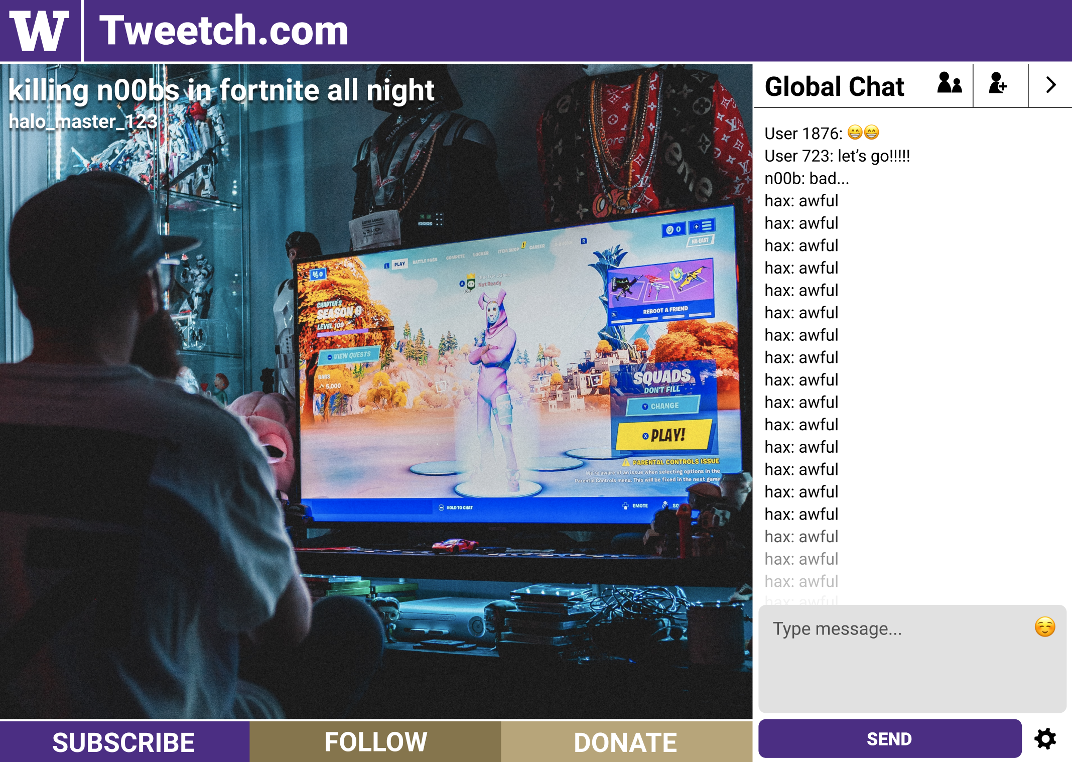
Our team created mockups and a prototype for usability testing.
Our goal:
Keep the consistency of what people expect to see on a live streaming platform. Ex. A place to see the stream, a place to see the chat, etc
User friendly design without needing to teach users how to use the app
Usability Testing & Iterations
Usability Testing:
Our team created a usability test plan that outlined:
What our purpose was
What user tasks we wanted to test
How we wanted to approach the usability test.
Using the prototype our team created, we could:
Begin testing with users
Give our team design insights on what to change for each iteration and why.
Usability testing our prototype with participants
Iterations:
Using the insights from usability testing, we could recommend to our team what design improvements we could make to enhance the user experience.
Design iterations:
Fewer and simpler icons
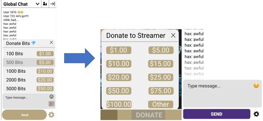
Reduce affordances with clickable icons by differentiating icons more clearly (don’t have multiple similar-looking icons for different actions), combining actions into sensible groupings (e.g. chat channel actions, account settings), and disambiguating placements (e.g. separate donation button from the text box).
User tests: Of our 6 participants, 5 found that the social icon was confusing and expected group management; 5 were confused about which icon would lead to donation; 4 were confused about the carat symbol to manage groups
Easy and quick mute actions
Hovering on (instead of fully clicking on or searching) a username in chat to mute is faster and lowers the barrier to discover and perform the action, which for muting an undesirable chatter should be seamlessly efficient.
User tests: All 6 participants struggled with the complexity of muting users
User tests: At least one user mentioned that they appreciated there were multiple methods to mute, so we decided to make that more clear with hover
Clear and deliberate interactions for actions with greater commitment
Build trust with the user by slowing down interactions for deeper actions such as monetary transactions (e.g. with a separate and clear button, with checks and confirmations).
Clear and deliberate interactions
User tests: Users were notably distressed by immediately seeing payment options after clicking the donate button
Flexible views
Users have different needs and goals, so need clear options to personalize the viewing experience (e.g. collapsing chat view, personalizing chat filters for visible text, changing granularity and privacy of chat groups).
User tests: In intro questionnaires, participants mentioned they often wanted to focus just on the video
User research: Many users indicated that they would prefer to watch the video on one screen and communicate on another
User research: Users indicated the chat was distracting from the content of the stream
Final Prototype & Final class presentation
Final Prototype:
Going through our iterations provided our team with our final prototype design for sharing looks and styles with others on Nordstrom’s mobile app.
Final Presentation:
At the end of our HCDE 518 class, we created a video that goes over our design solution so that we could share it with our class mates and peers.


